Ergonomics is defined as the study of people’s efficiency within their working environments.
It focuses on creating stress-free workplaces through products, like chairs, keyboards, and desks, that consider body mechanics and physical stress. Ergonomic principles prioritize comfort, usability, and functionality.
Applied to virtual products like user interfaces, these principles can inform more usable, effective, and enjoyable platforms.
Applying Ergonomics to User Interfaces (UIs)
Features that enhance and streamline the user experience draw their philosophy from what works in the physical world: comfort, usability, and function.
Applying these principles to the visual elements of a digital product results in benefits like clear workflows, efficient processes, and easy navigation, all essential factors in ensuring a positive user experience.
The UI is what the users see and interact with. Think of it like the layout and design features of a house.
The user experience or UX is the feeling users get after using the interface, or in this analogy, after visiting your house. How easy was it for them to find the bathroom? Was it intuitively located? These same questions apply to navigating a UI, especially when looking for specific information.
A widely accepted web design principle is the rule of three clicks. This states that users will become frustrated if they cannot get to what they are looking for within three clicks. Similarly, in ergonomics, products are created to help consumers quickly achieve their goals.
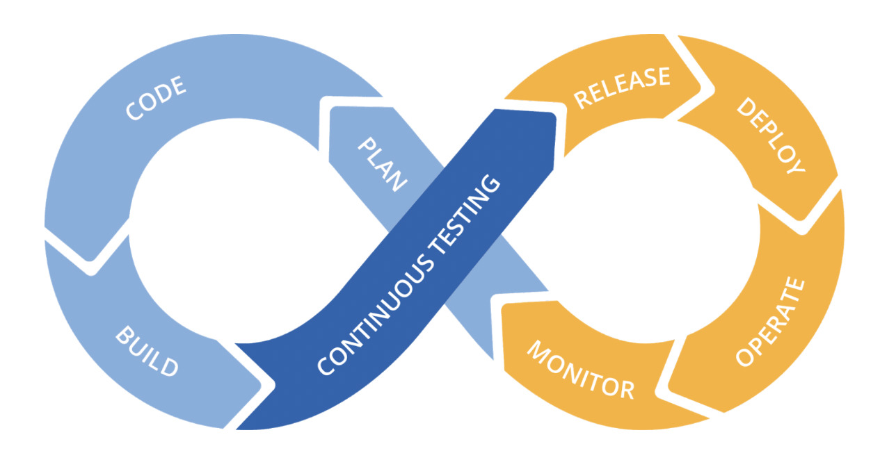
The right UI should yield a favorable UX. And the user’s experience should continuously inform changes to that interface. The DevOps method adopted by most other ops teams, including NetOps, SecOps CloudOps, etc., is a continuous improvement loop. Compelling UIs also follow a similar cycle, incorporating UX into the look and feel of the product.

The 3 Ergonomic Principles That Contribute to Succesful NPM UIs
A network monitoring platform designed with ergonomics in mind would focus on the elements of comfort, usability, and functionality to achieve peak product performance. Here are some questions in each category to help you access the ergonomic soundness of your NPM UI.
1 – Comfort
Is the UX stressful?
Focus on minimalism to avoid overwhelming users. In the case of NetOps trying to solve problems quickly, less is more. Too many features and functionless eye candy can result in dead-end searches and delays in network troubleshooting and, ultimately, resolution. Keep the design simplistic and purposeful with the question always in mind, ” what goal does this component help a user solve?”
2 – Usability
Usability in this context is how easy it is to use an interface.
This principle focuses on website layout, navigation, and how easy it is for users to find their way to a solution. How many steps does it take for a user to achieve their desired result? Can they access where they need to go through the menu options naturally without getting lost down a navigation rabbit hole? Avoid overloading the user’s memory. Short-term memory lasts for only 18-30 seconds so achieving a goal within that period is optimal for usability.
Attention is a subcategory of usability that can make the UI easier to use when focused correctly. Font sizes can clarify what elements on a page are the most important. Attention can also be focused by using universal color association colors, like red to indicate risks or problems, yellow to show warnings, and green to signify something positive.
3 – Functionality
Functionality in this context is the type of operations the interface supports. When considering the functionality of an NPM platform, you may have specific questions about your integrations. For example, can this UI integrate with your Fortinet SD-WAN or your Cisco SD-WAN? How compatible is this monitoring platform with your other suite of technologies? Is this tool vendor-specific, or is it agnostically compatible? What types of data is the platform able to ingest? Are the monitoring techniques limited to either packet capture or flow analysis, or does the platform offer a combined approach?
Functionality is key to determining the limitations of the NPM you are evaluating. The more functional it is, the fewer additional tools are needed for operational success. Identify an NPM that can minimize tool sprawl.
Whose Opinion Matters with NPM UIs?
The end-user is always one of, if not THE most critical opinion in the room regarding a UI. In the case of NPMs, the user monitoring and managing network performance could be a NetOps engineer or network analyst. Their experience needs to inform the strategy behind the UI design for the tool to succeed in the market.
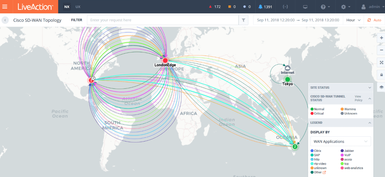
This is why LiveAction performed user testing with engineers when designing LiveNX. The network topology visualization follows the mental model of how engineers think and is tailored to how they prioritize information.

Costs of Ignoring Ergonomics in an NPM UI Design
Organizations stand to lose market share from the disconnect between their product and the users they hope will purchase it.
In taking a quick look at product reviews for NPM platforms, the top complaint points specifically to these ergonomic principles of comfort, usability, and functionality.
Again and again, are complaints that user interfaces are overwhelming, too advanced, too intense, difficult to get into, and challenging to use. Other complaints include complex navigation, weak integrations, and too many choices.
While the saying “Form over function,” championed by modernist architects of the 1930s, is not correct in this situation, neither is function over form. Both must be balanced in a constant dialogue between the UI and the UX to achieve an NPM informed by user needs.
About LiveAction
LiveAction provides complete network and application performance visibility across multi-vendor, multi-domain, and multi-cloud networked environments for increased productivity and a better user experience. Enjoy our real-time network topology mapper to visualize discovered devices, interfaces, applications, VPNs, and users. Network and application performance data is shown in context on the network topology in an easy-to-interpret visual display.
Want to try out the look and feel of LiveAction? Reach out to us to schedule your 1:1 demo today.


